


Bluebeam Revu is a PDF markup, editing, and viewing solution for the AEC (Architecture, Engineering and Construction) industry. For the 2018 release, the UI was updated, which included information architecture changes in the form of updated top-level menu navigation. My responsibilities spanned leading the UI and UX for the greater Revu product team.
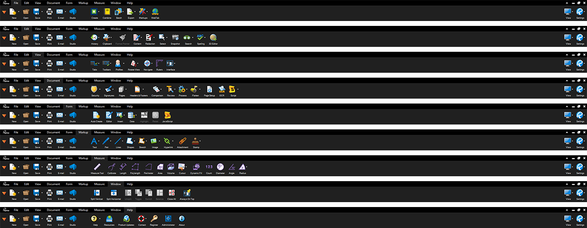
In 2012, Bluebeam released Bluebeam Revu 10 with an updated top-level menu navigation. This navigation was very similar to, and inspired by, the popular ribbon navigation bar of the time.
While it improved adaptability and UI aesthetics, it was not as sustainable as a menu navigation solution for a sandbox application such as Revu. Much of the underlying information architecture was untested and dependent on tribal knowledge, which proved troublesome when it came time to add new items.
The goal for menu work in 2018 was two parts — validate our usability assumptions of the current ribbon navigation, and re-introduce a traditional pull-down menu navigation solution that would lay the groundwork for further iterations.
To understand how we needed to organize our menu, we first had to see what needed to be organized.
We pulled everything out of the current ribbon and into a spreadsheet. From there, we did a first pass at card sorting by looking for the high level themes specific to our AEC software industry, and themes common in all software. Utilizing Bluebeam’s internal sales and support team, we collected data on the common where-is questions.
All this guided the early formation of menu categories and placement of items therein.
The design phase was comparatively brief, as a top pull-down menu is part of the standard Windows control library. One significant design decision regarding the use of icons versus no icons in the menu came down to user preference, with the majority heavily favoring icons.
During customer interviews we found no significant evidence leading us to the preservation of the ribbon navigation bar. Users were more frequently using the ribbon as a shortcut for a tool which, ironically, was less of a shortcut than if they had customized a toolbar with that tool. In other words, the ribbon navigation bar wasn’t solving any problems that Revu couldn’t already solve, and it was demanding a large portion of UI real-estate.
User response was roughly 80/20 — 80% agreed with or were not effected by the change in menu (Revu always allowed users to toggle off the ribbon), and 20% were disrupted by the change. For that 20%, the majority missed the simplicity of the icon buttons that the ribbon provided, outside of being able to still create a ribbon experience (Revu allows the customization of a toolbar anywhere in the UI).
Despite this, the pull-down menu was successful in establishing the groundwork of more comprehensible information architecture throughout Revu, and the start of a more iterative and flexible menu navigation.