Bluebeam Revu for iPad
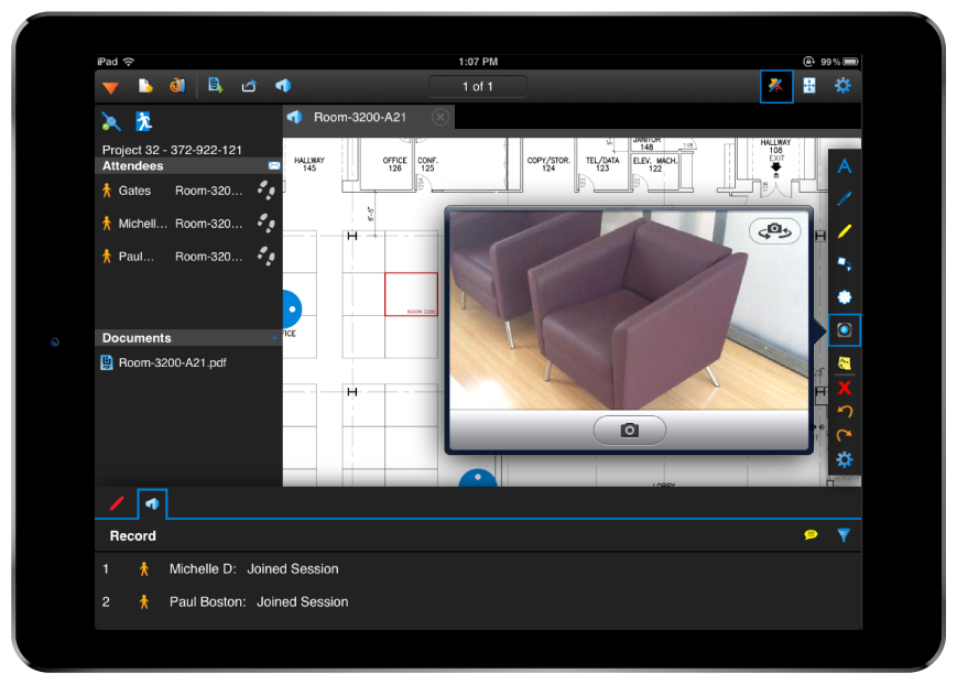
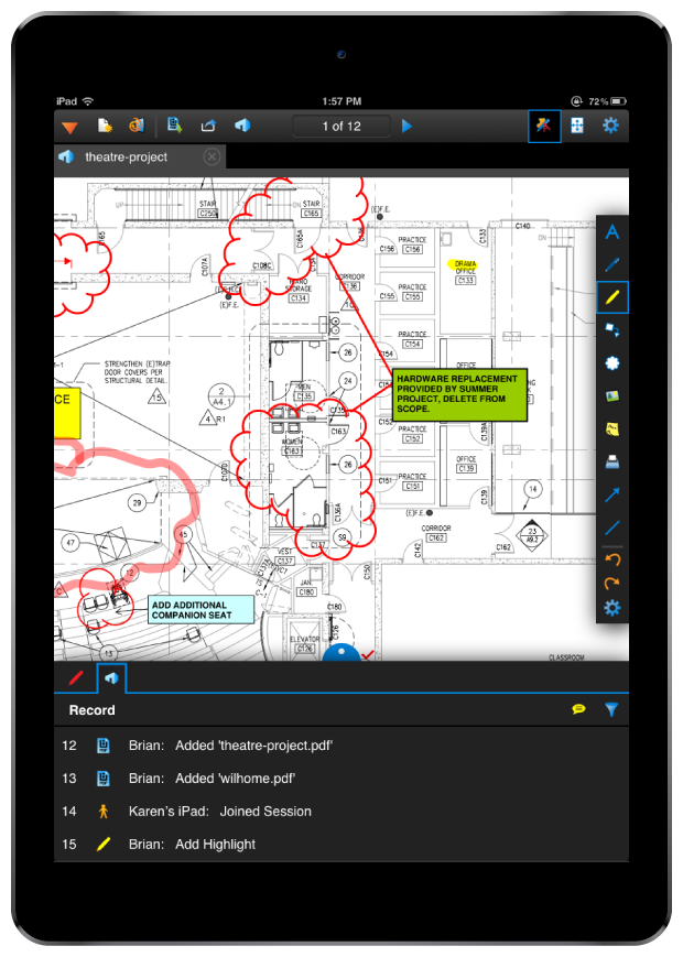
In 2012, Bluebeam pushed their brand hard. Not only did they roll out new a UI/UX with version 10 of their flagship product Bluebeam Revu, they released their long-awaited mobile app version, Bluebeam Revu for iPad. I was responsible for all UI, icons, and in-app assets.
Designed to be familiar
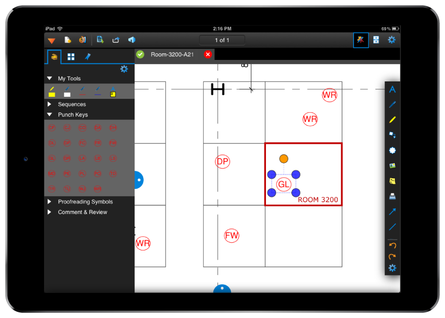
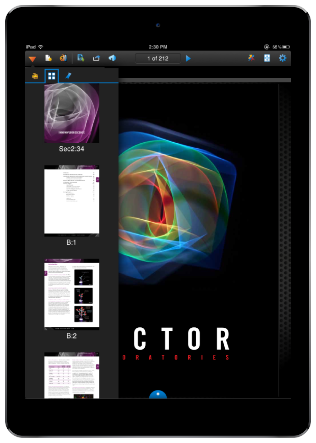
While technically impossible to achieve complete parity, as much of the desktop experience as possible was carried over to the iPad — our users were already using the desktop application on their laptop as a mobile solution, so the change to iPad had to make sense for them in both features and experience.
Development for Revu for iPad started in 2011 around the same time as the new UI work for Revu version 10. Because of this, we were able to keep a consistent look and feel across all platforms.
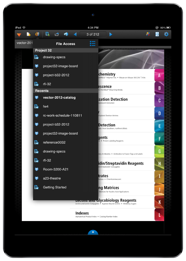
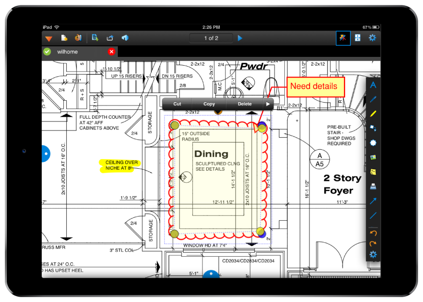
Not every feature made the leap from desktop to mobile, only what made sense for the format.
